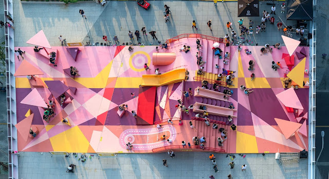
Colour and Texture
I spoke with quite a few of you about texture and colour last week and wanted to add a little bit more to what we discussed. One of the rules of thumb I gave you is to stick to no more than 4 colours or textures to avoid saturating your architecture. I wanted to include a beautiful piece of architecture that totally disregards this, the image above is the Big Bang Rootftop Playground by 100 Architects. In this project colour is used to create energy, encourage movement and attract play and exploration. The guidelines I gave you are a way to avoid complicating or cluttering a design, however please feel free to explore colour freely if you think it is important to delivering your distinctive concept.
Different colours create different sensations in architecture. You should choose colours or an absence of colour based upon the way you want the occupants to experience the space in addition to your own style. Archdaily has a good article on colour, titled 'How Colour Affects Architecture' that you can access here.
Another important consideration for colour and materiality is where it is located. Another Archdaily article 'How Colours Change the Perception of Interior Spaces' gives some good examples of how the positioning of texture or colour can alter the way the space is perceived.
I think the biggest takeaway is to explore colour and texture in your designs but always test your iterations against the spatial qualities you are trying to achieve.


Comments
Post a Comment